
I have no opinion on 8-track art.
Check out A Grand Design for album art commentary, as well as for good/bad promo shots, show posters, and whatever other mediums that've been (in)adequately designed.
Also check out the not-updated-in-a-year
I'm sure there are countless other album art websites out there, but you should also check out album art BOOKS. "45 RPM: A Visual History of the Seven-Inch Record" by Spencer Drate, for instance. Or "1000 Record Covers" by Michael Ochs, a favorite of mine. Michael Ochs actually has several books about rock and roll imagery and history. If that kind of thing interests you then definitely check out his contributions.
"Albums: The Stories Behind 50 Years of Great Recordings", though not explicitly an album art book, does spotlight a boatload of great albums and, consequently, great album covers (in addition to some awesomely lame covers).
Anyway, having mentioned all this, I think it's high-time I introduced another feature.
il Buono, il Brutto, il AlbumArto.
Take a band. Take its album cover highlights. Take its album cover lowlights. Swish it all around in your mouth. Comment.
First up to bat, Genesis (appropriately).
 (click for bigger)
This is from Genesis' first live album, released in 1973. It'd only be a decent and un-noteworthy live shot were it not for the absolutely terrifying existance of Peter Gabriel looming between band members in one of his many freako costumes. This picture gives me nightmares, but it's one of my all-time favorite covers.
According to the official Genesis website, "front photograph courtesy of Bob Gruen".
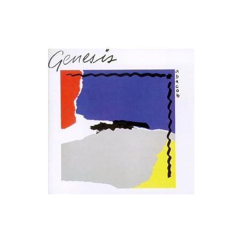
 (click for bigger, but what's the point?)
This is the cover to the 1981 album Abacab. I hate it. The design itself is garishly 80s and pointlessly abstract. The "Genesis" font appears to be the same one a cosmetics company would use. The whole thing also sort of reminds me of the Young and the Restless squiggle. Interestingly, subsequent re-releases feature the same image but with differing colors. More aesthetically pleasing? Perhaps, but I could also paint my feces bright pink and say it's more "aesthetically pleasing".
Cover by Bill Smith, by the way.
 (click for slightly bigger)
Genesis' 3x3 EP, released in 1982. I'm mostly just impressed with Phil Collins' air. Blatant homagery, see also The Beatles' Twist and Shout single.